BORK Packaging System
Visual identity and packaging concept
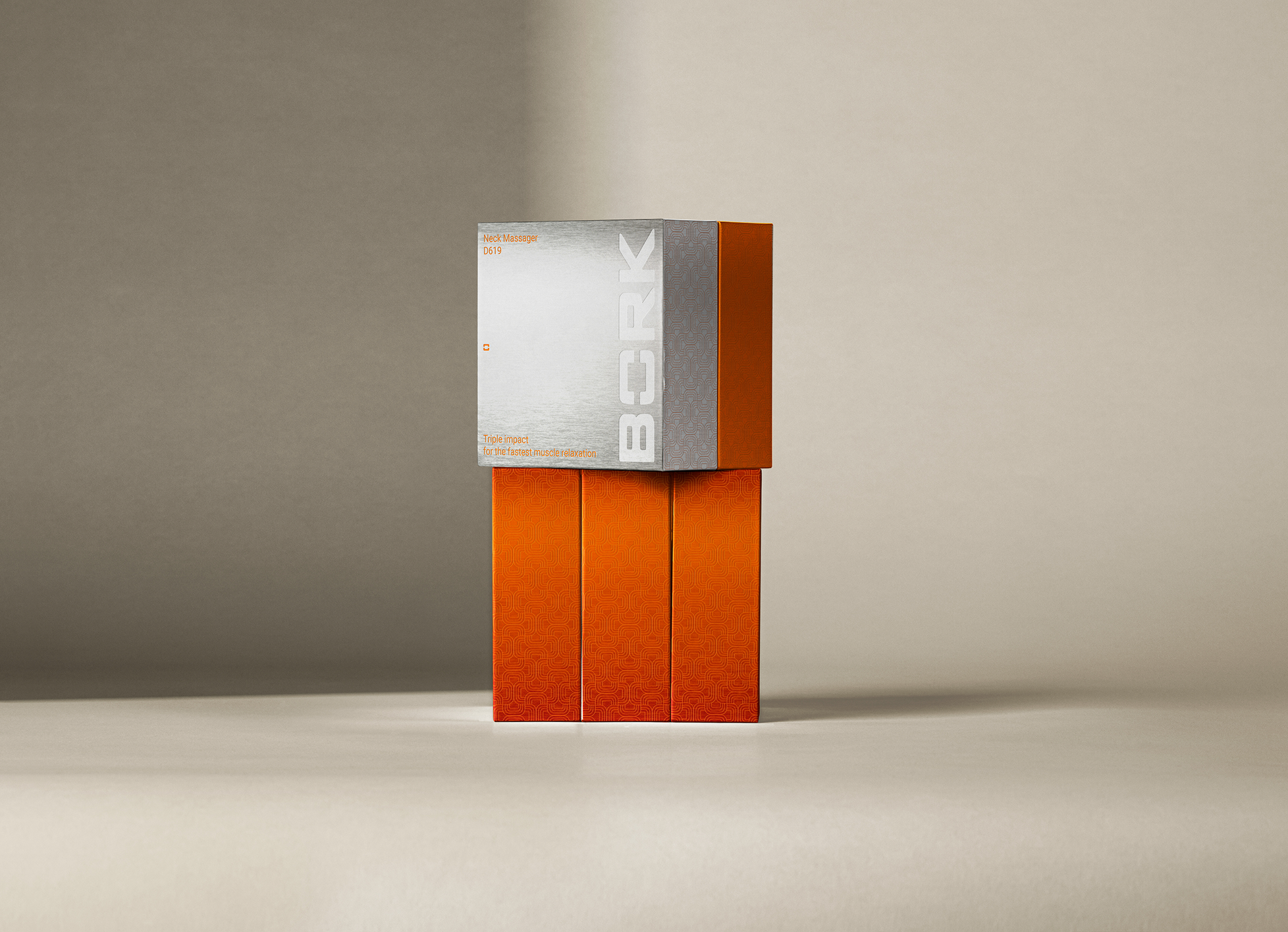
Packaging design and photorealistic renders created to present the final concept
Challenge
Updating BORK’s packaging with warmth, texture, and modern clarity
The goal was to make the design feel current — adding emotional texture and material presence without losing BORK’s minimal, engineered DNA. The challenge lay in balancing the brand’s high-tech essence with a natural, timeless feel.
.png)


No items found.

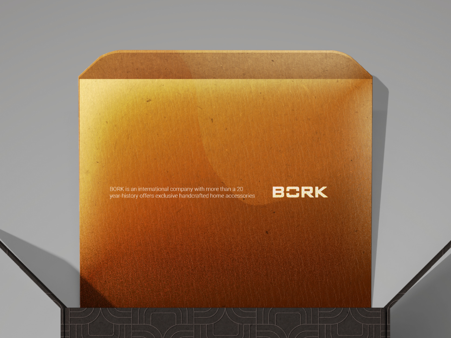
I developed a new material direction built around three core tones
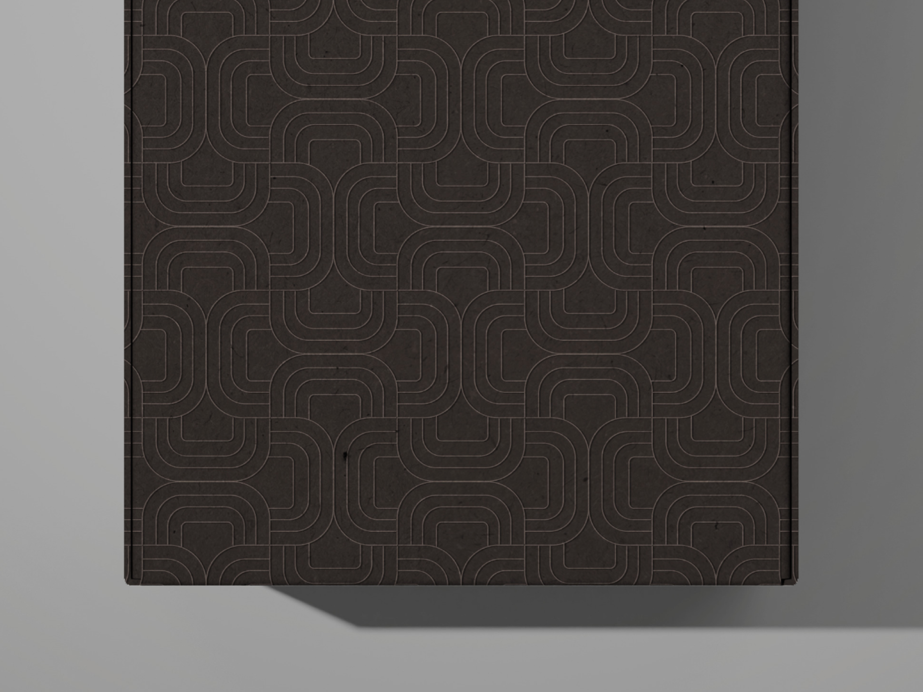
The logo remained central but evolved into part of the texture itself: embossed into the surface as a continuous pattern, turning the graphic symbol into a tactile ornament.Metallic gradients and foil accents add modern light play, while the matte base creates balance and calm.
.png)